Google’s changing the way people find businesses – what does that mean for you?
Customers find businesses online in a variety of ways: Typing a domain directly into the URL bar after seeing it in an ad or on a truck or clicking through from social media links.
But when it comes to your online existence, nothing compares to Google Search. With 83 percent of the search traffic, it’s little wonder that searching and “Googling” are used synonymously.
The most significant Google Search change in years—dubbed “Mobile-geddon” — is coming tomorrow, and it could be a game-changer for your business.
As of Tuesday, April 21, Google will be shuffling the order in which websites appear in mobile search results, favoring those websites it deems “mobile-friendly,” or those that fit nicely on a small smartphone screen without requiring much pinching-and-pulling to view.
Websites that pass the test will rank higher and have more impressions and more clicks from Google Search. Consider: The first 10 results (the first page, basically) get 90 percent of the clicks. That’s huge when you consider 3.5 billion searches are conducted on Google each day worldwide.
 What is mobile-friendly?

Being mobile-friendly at its simplest means having:
- user-friendly design with readable font sizes and easy-to-press buttons,
- easy-to-navigate menus,
- images and videos that are viewable on desktop and mobile, and
- fast load time.
Is your website mobile-friendly?
Here are three tests to run now to find out how you’re doing on mobile.
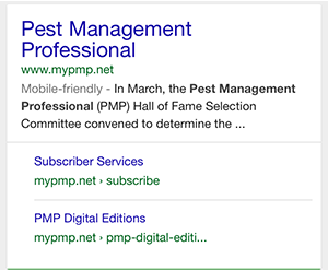
1. Get on your smartphone and search. In the browser, does it say “Mobile-friendly” underneath the name of your website? This is the first indicator of how your site is doing.
This isn’t, however, the final word. If your site is utilizing doorway pages – one or two pages that are mobile friendly while the rest are not–this gaming of the system isn’t going to cut it in the new Google landscape. Your entire website needs to work on a smartphone, not just the homepage or a single landing page.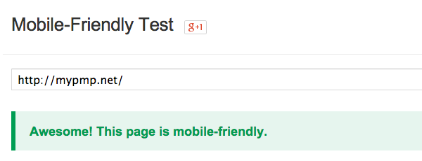
2. Run Google’s Mobile-Friendly test. If you pass, you get an “Awesome!” Nice feeling, right? And if you don’t pass, you’ll get to see how your site looks on a smartphone, a list of resources on your site to start fixing and some tools to get started on becoming mobile-friendly.
3. Dig into your Google Webmaster Tools. If you haven’t already signed up for Google Analytics, you should do that first–it’s a good step anyways to learning more about your website’s visitors and what’s working on your site. Then in your webmaster tools, go into “Other Resources” and then “Page Speed Insights.” In this more advanced version of the mobile-friendly test, you’ll get a grade on your site’s speed and overall mobile user experience, plus a detailed report of what you need to do to improve.
Time to invest?
If you passed all three tests, congrats! If not, take this as the sign it’s time to invest in catering your website to mobile visitors. Whether you agree with Google’s decision or not, you have to play by its rules to have a high rank in its search engine. The good news: Google algorithms take time to roll out and this first iteration affects only search on mobile—not desktop search, Google News or images. Those will typically roll out in the weeks and months that follow.
Making your site mobile friendly is a big job, but one that’s ultimately a valuable customer service and marketing tool that can generate new business and meet your clients where they are – on their phones.
Leave A Comment